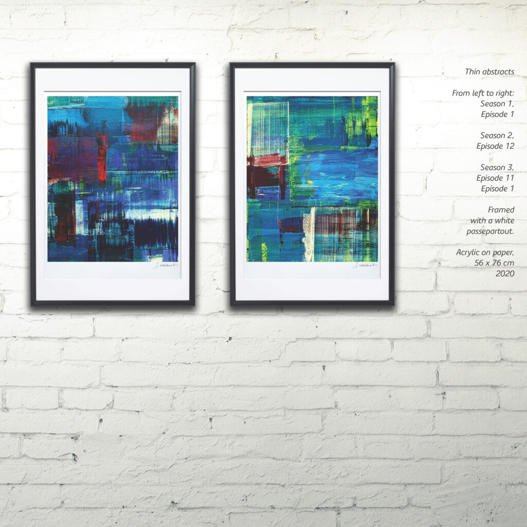
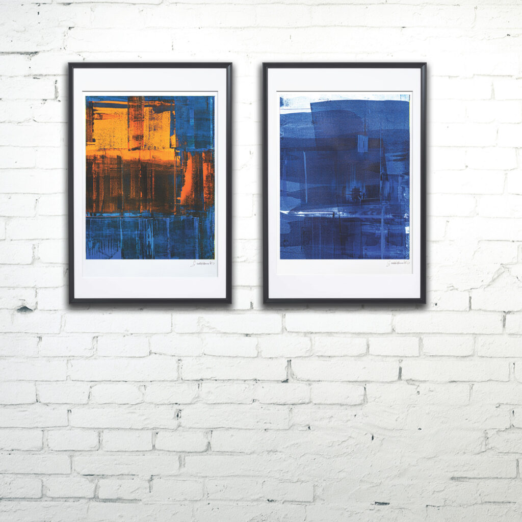
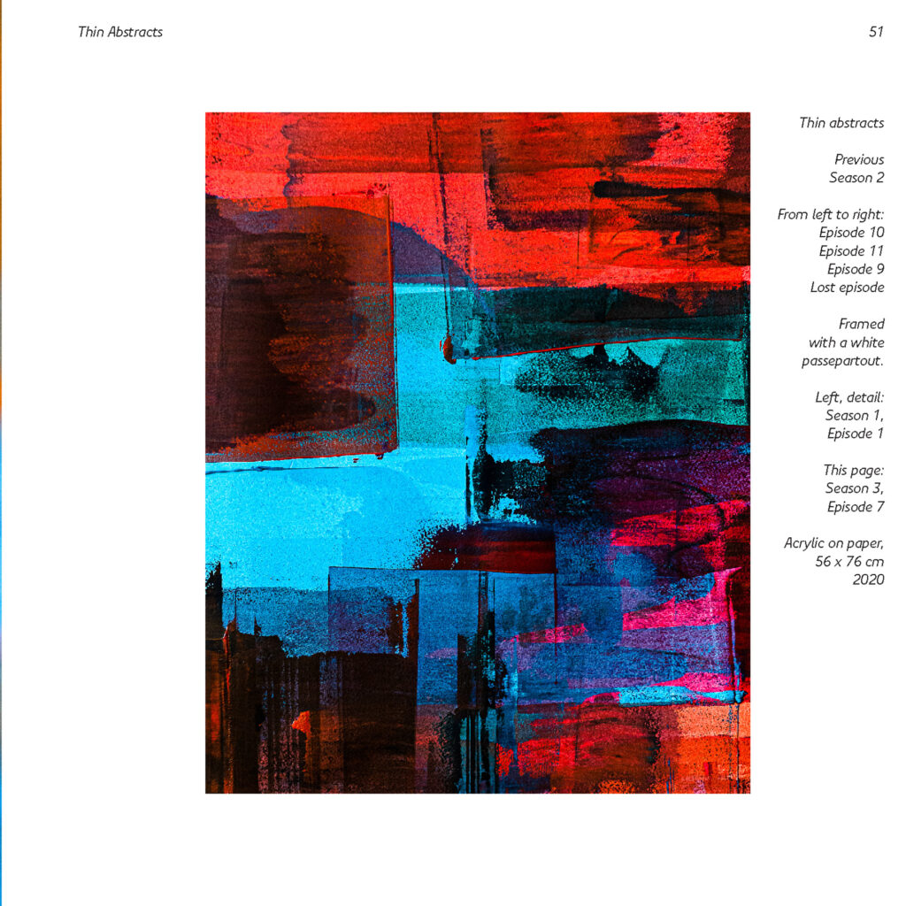


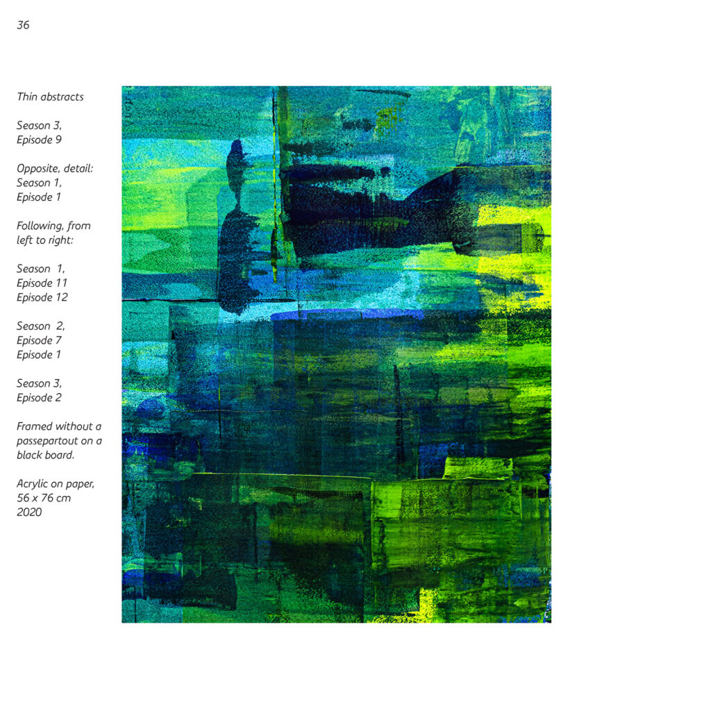

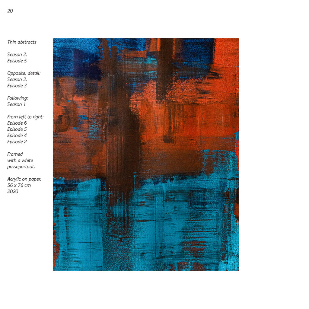

Abstracts, thin and precious
An introduction
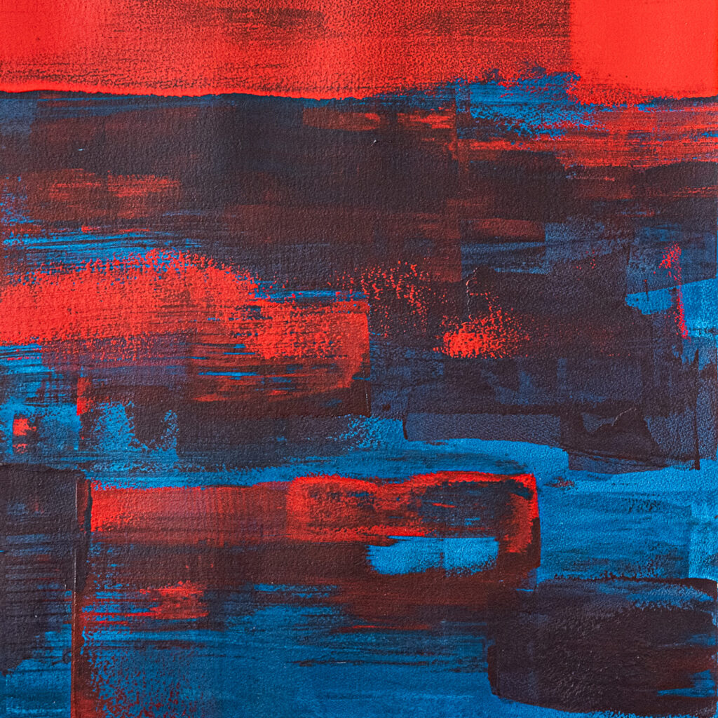
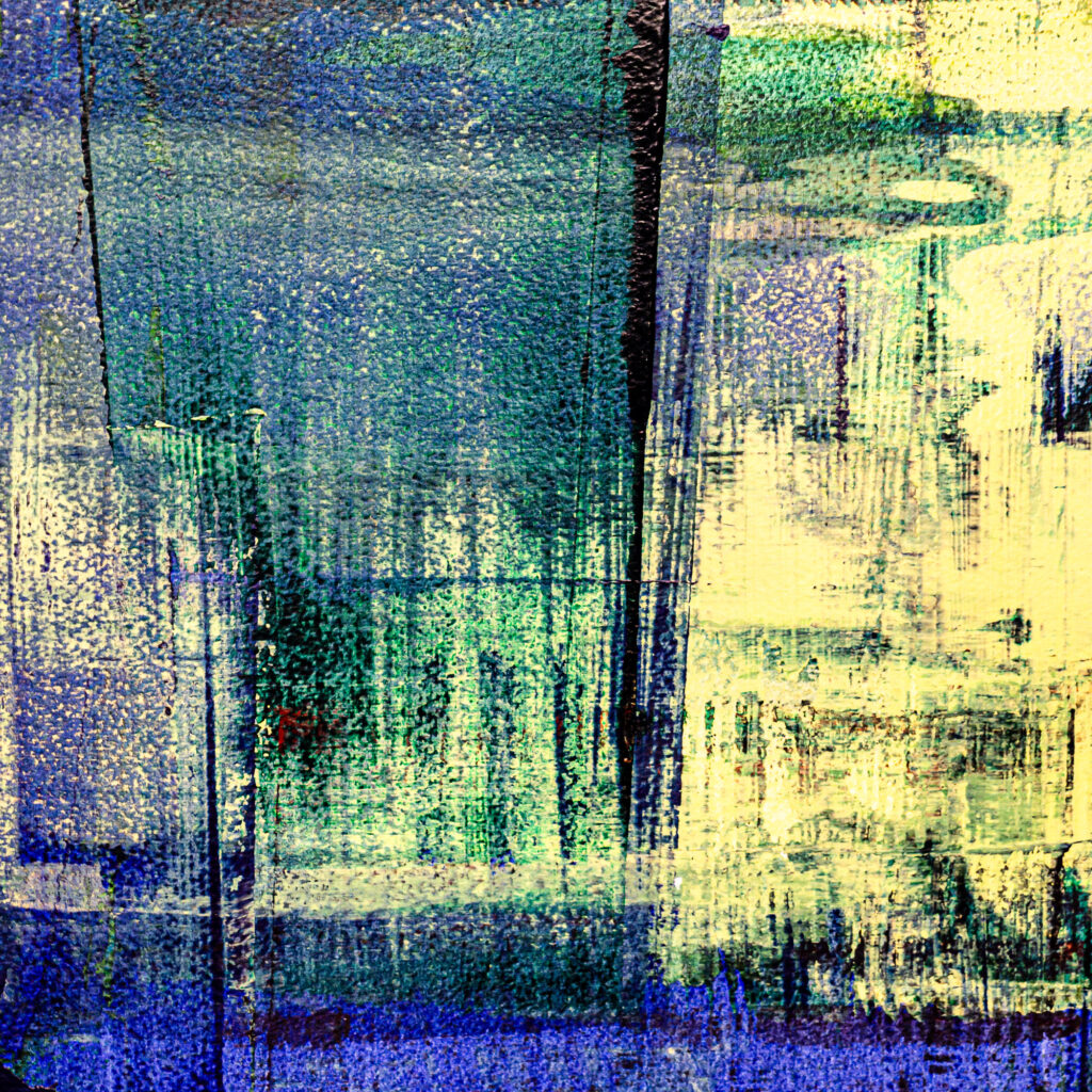
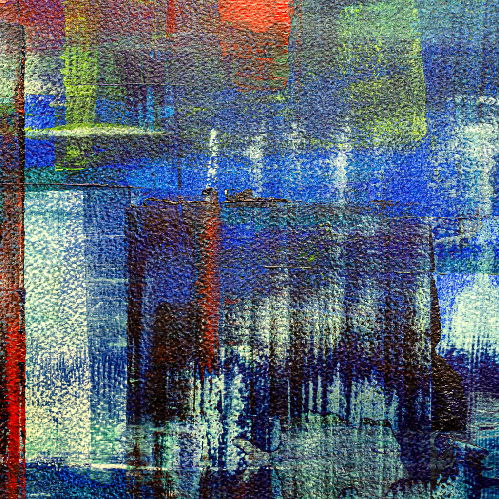
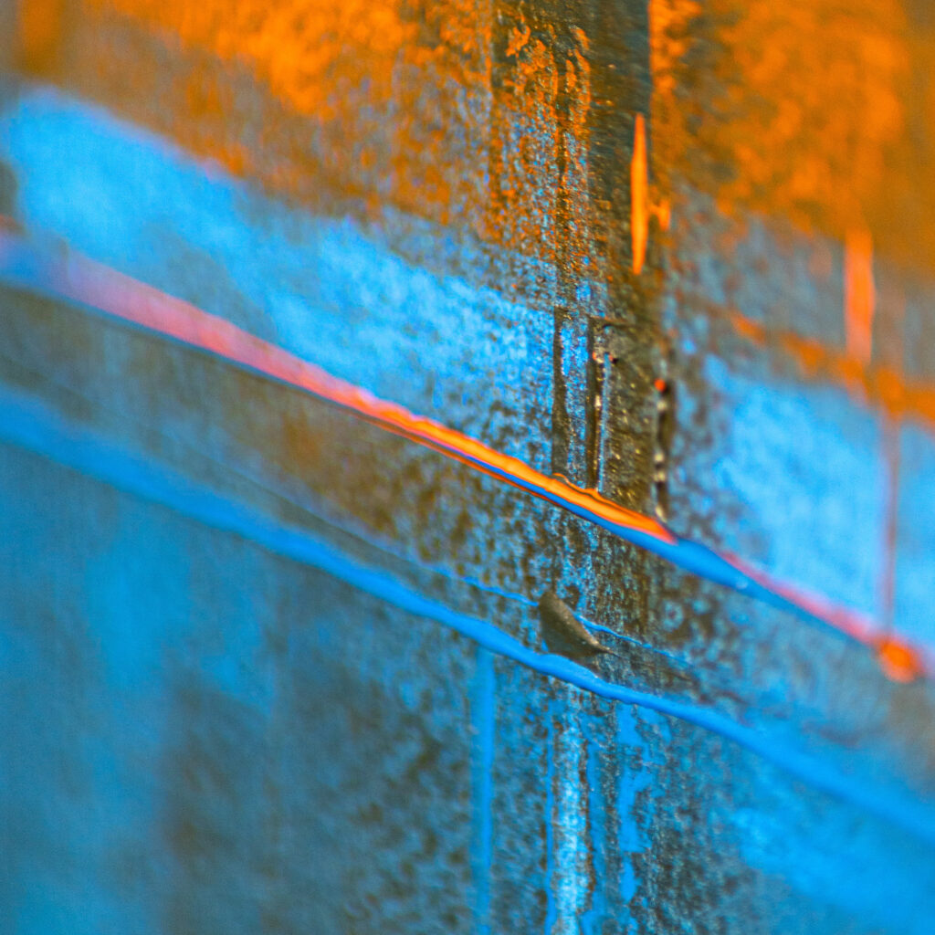
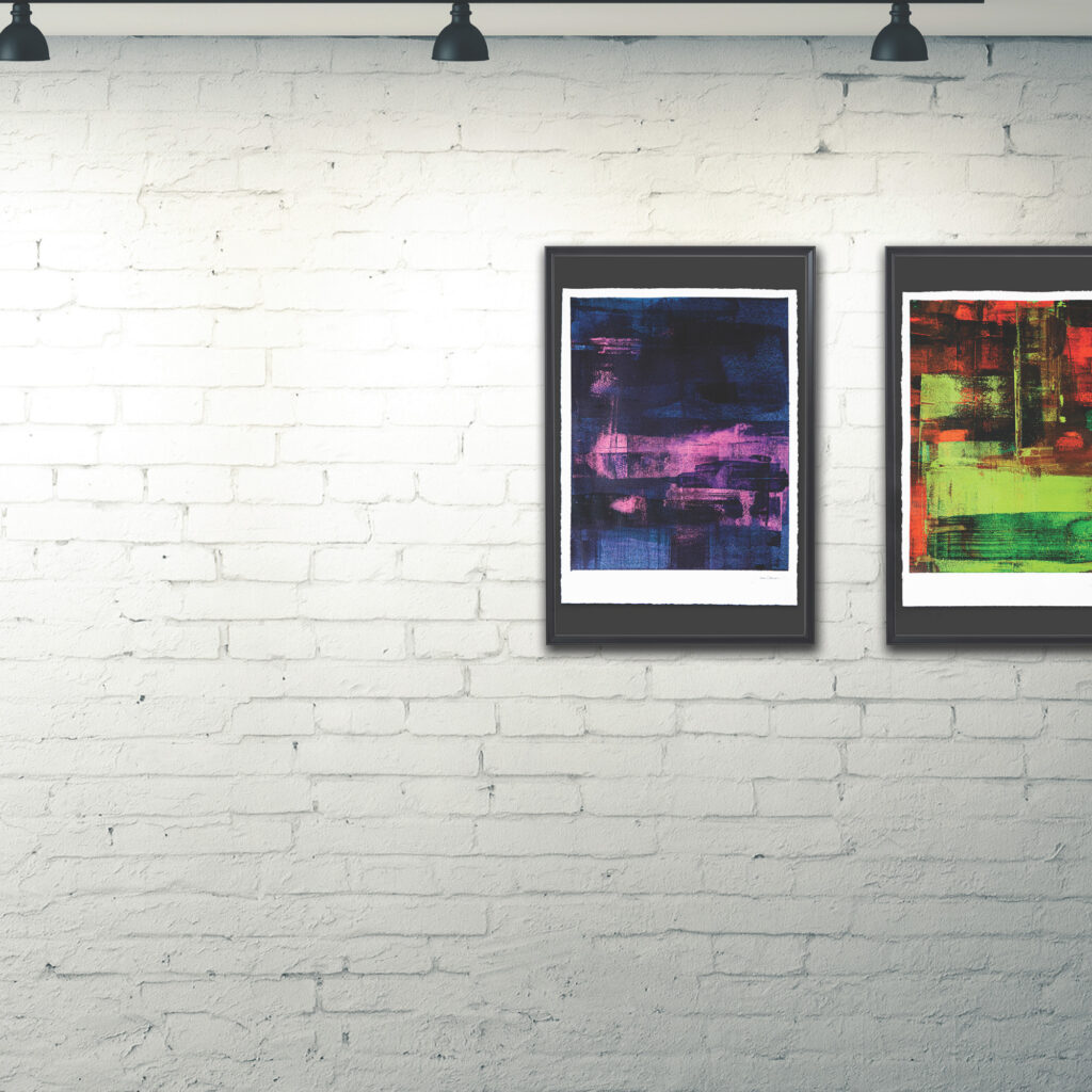
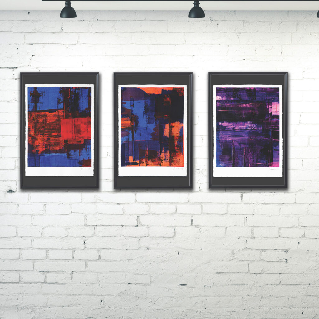
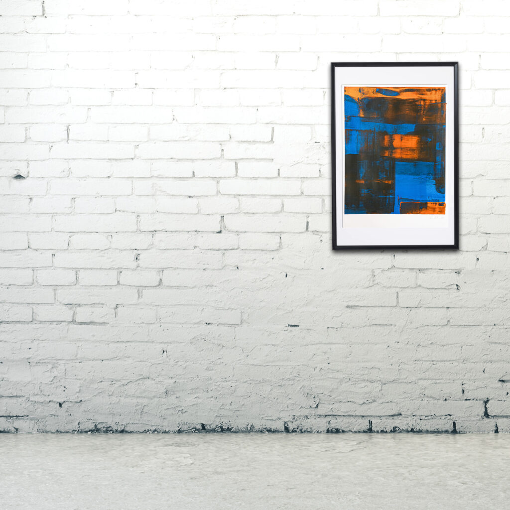
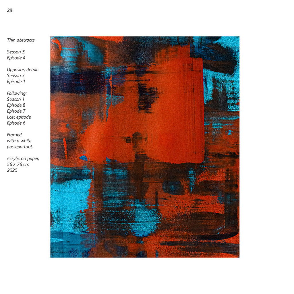
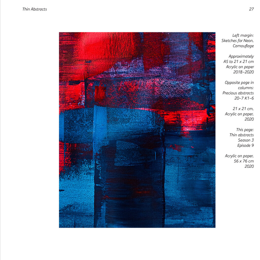
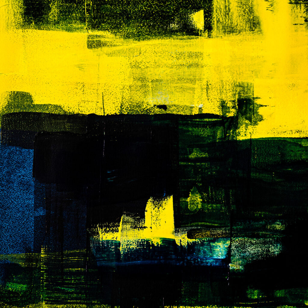
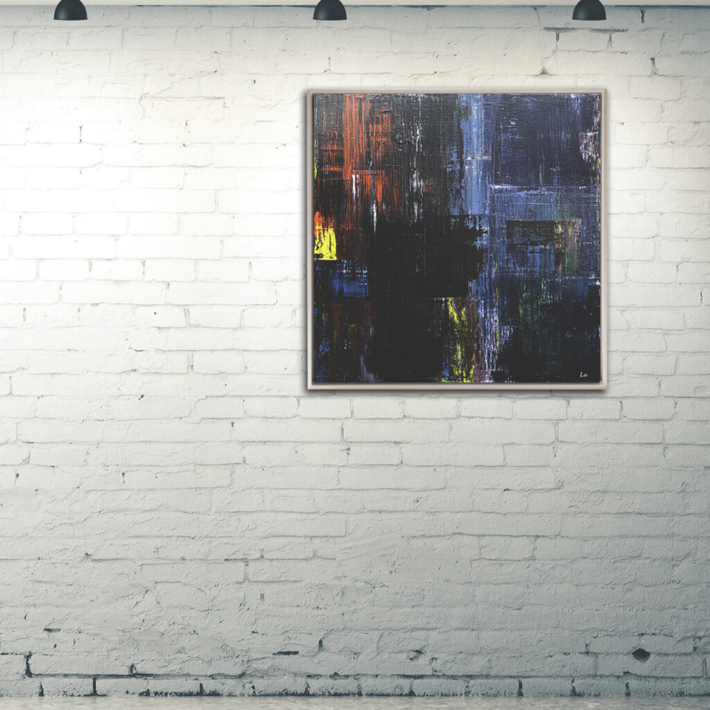
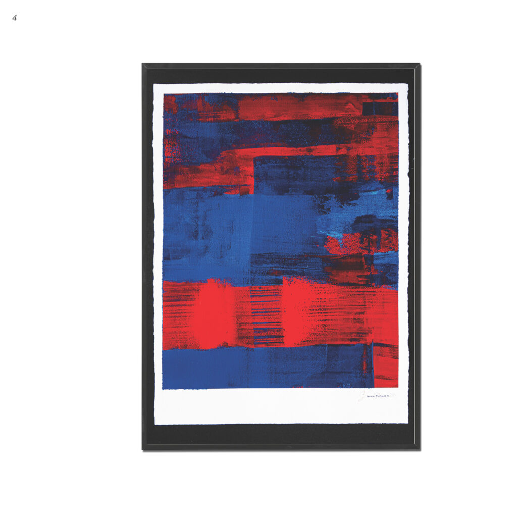
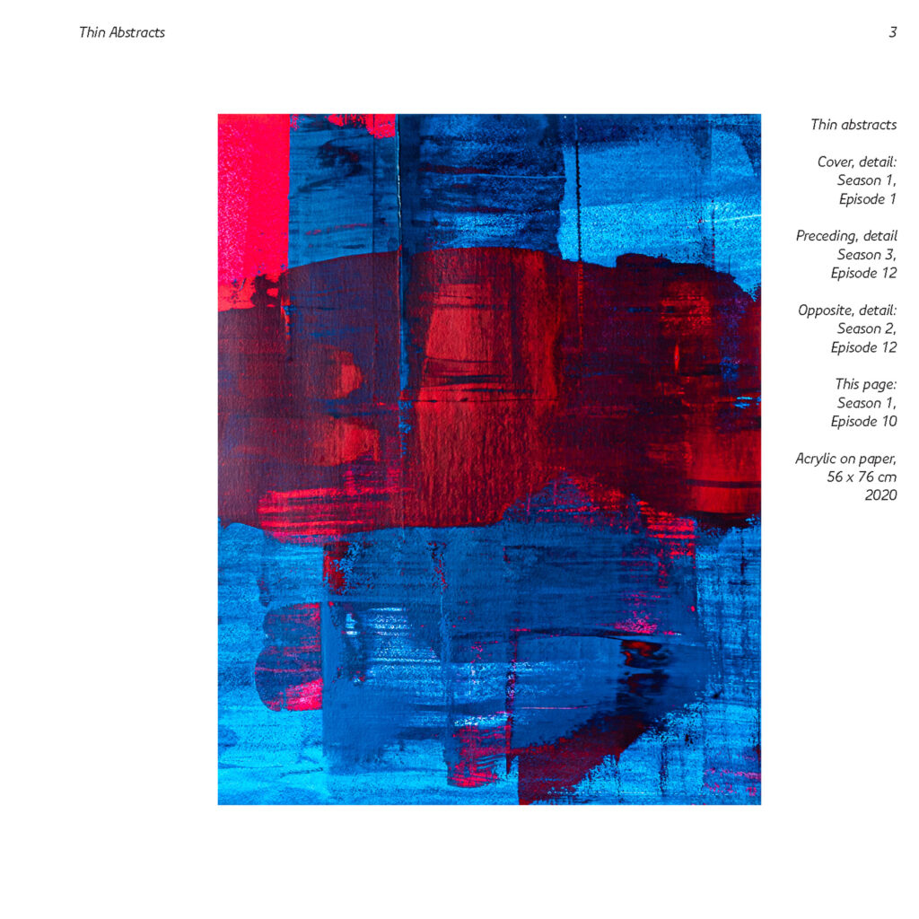
Somewhere in between printmaking and painting, the Thin abstracts series was inspired by the cathartic physique of “pulling” pigment over thick, textured paper. The tradition of “gesture painting” played a significant role here. With the concept of exploring how only a few colours mix, the idea for this series was born from experiments of creating gradients, from almost white to black, by utilising the combination characteristics of warm and cold, complimentary, and neon paints.
For decades digital and mobile spaces have been becoming continuously emancipated from their analogue, painterly origins, so that I have become increasingly interested in reproducing these techniques in acrylics. The use of gradients is a typical technique in order to combine colours in corporate design, reacting to the development of branding in digital channels. How would gradients look like, if they were large-scale acrylic paintings?
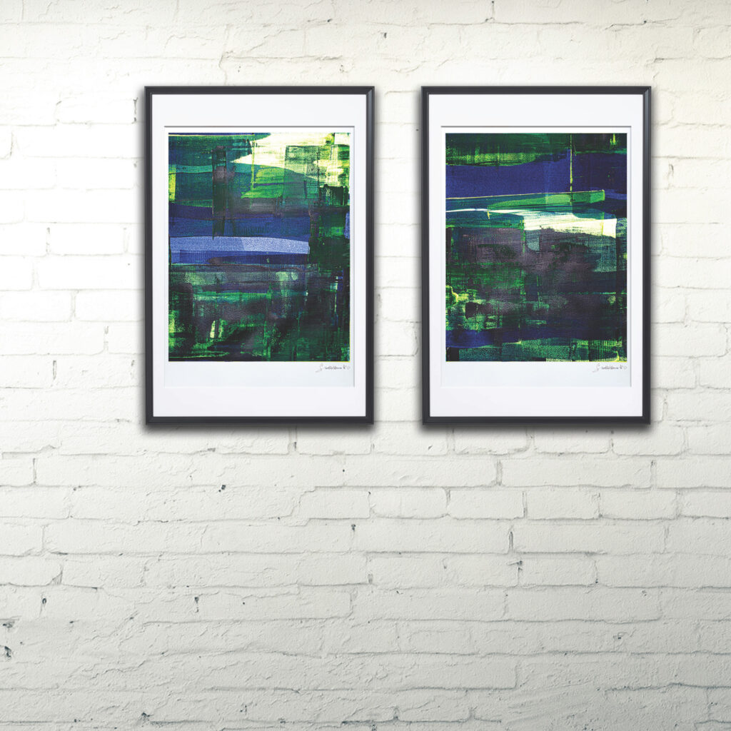
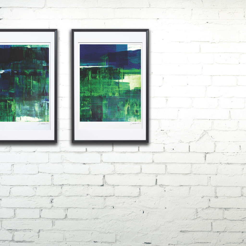
Gradients
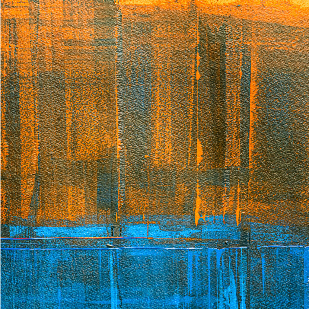
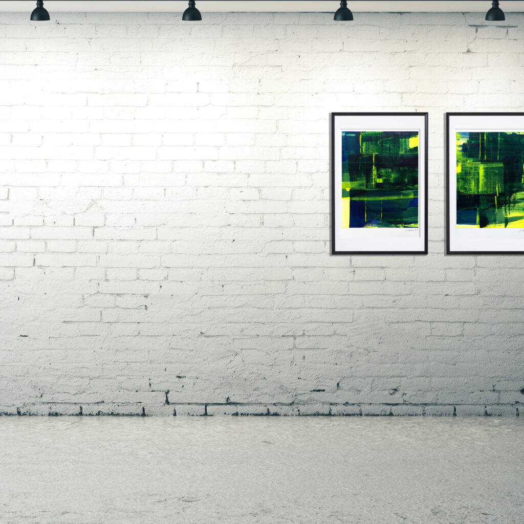
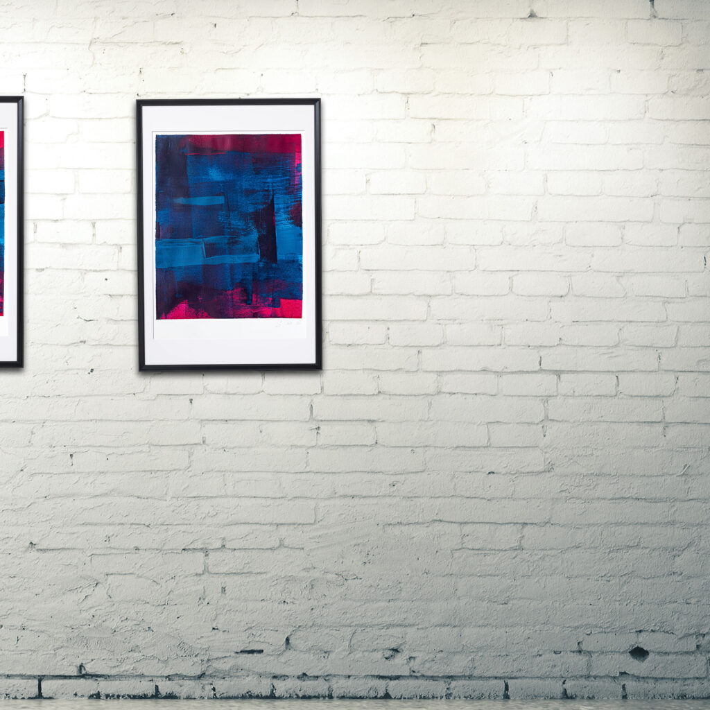
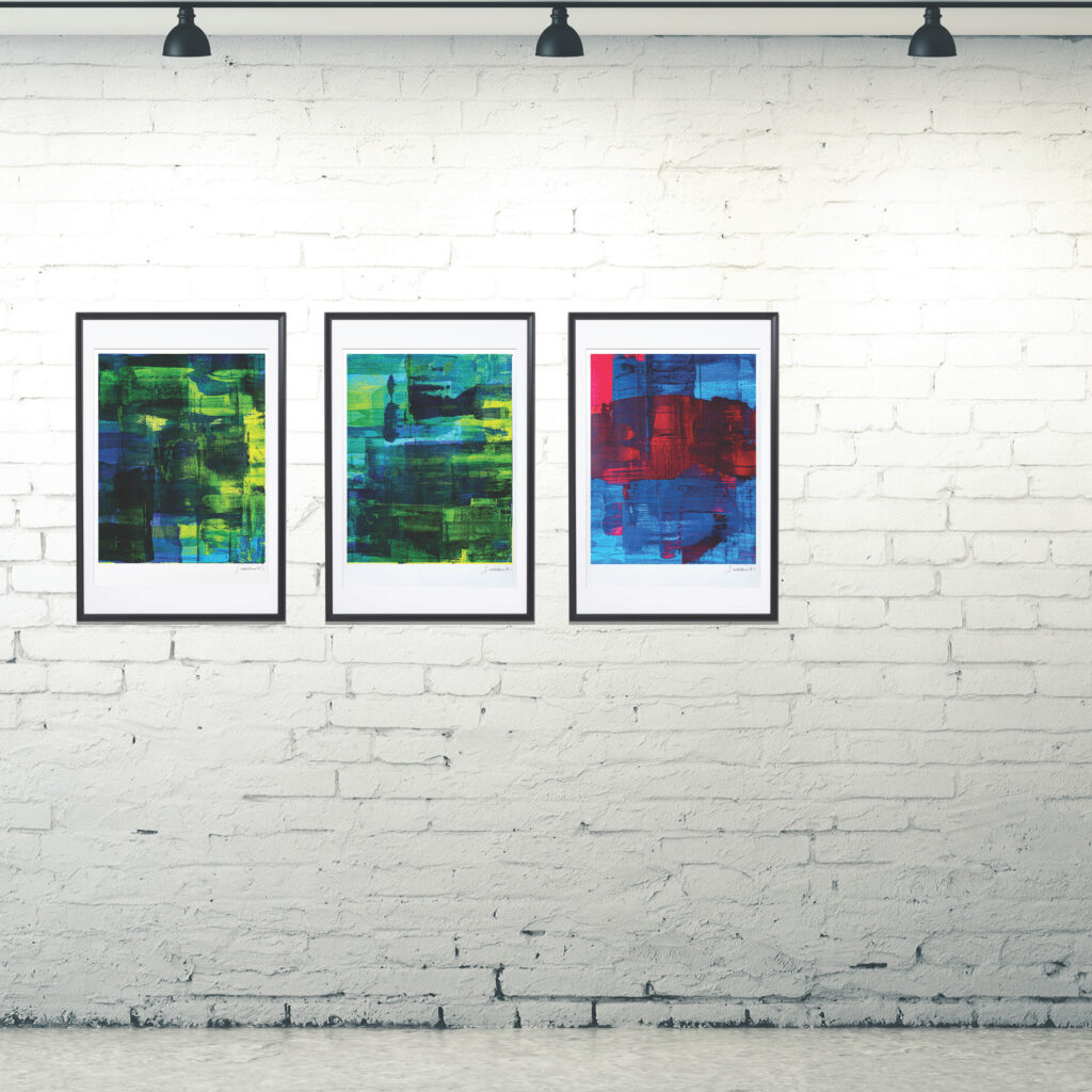
Gradients have opened new possibilities in graphic design by expanding the possibilities offered by designing “corporate” colours. A personality can be created by creating emotional responses through the combinations of different colours. The “seasons” or sub-series have different characteristic personalities: “dark” (Season 2), “retro” (Season 1, especially episodes 7 and 8), “optimistic” (Season 3, especially the brasilia runs), etc. With the advent of social media, a designer’s toolbox gained a new possibility beyond that of distinctive, individual colours, traditionally around five harmonising colour tones, by exploring the gradient, the in-between steps, of two or three colours. This process is always digital and faces the difficulties of creating seamless transitions in different colour spaces: RGB for light-based colour definitions (digital photography, for example) and CMYK for ink-based reproduction. The incompatibilities between the colour spaces, the gamut, is what makes this process so challenging.
Pigments eliminate this challenge, yet create wholly new difficulties. What would a gradient look like, when it’s produced with paint?
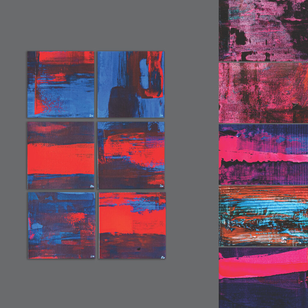
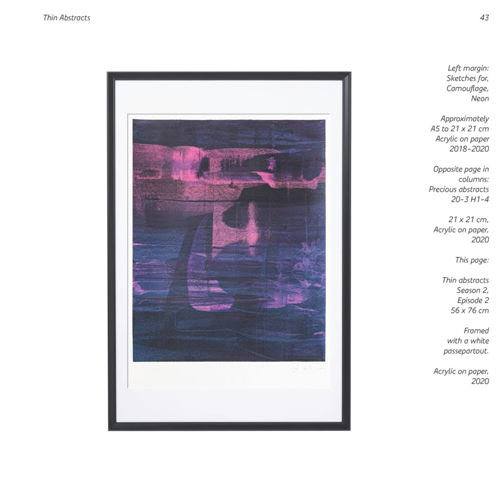
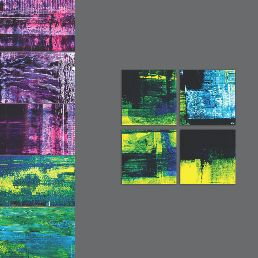
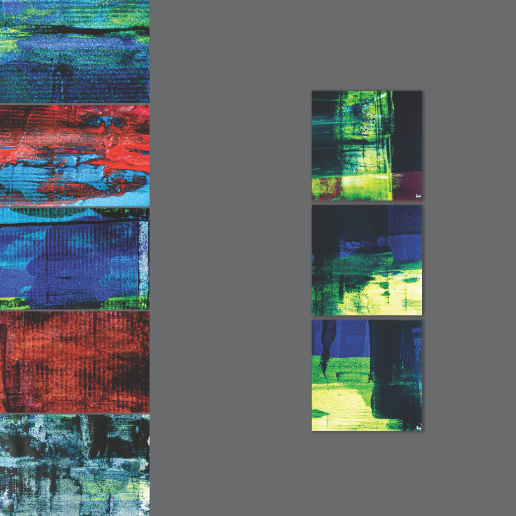
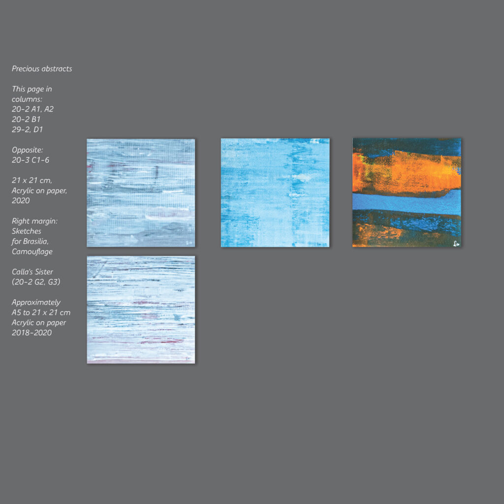
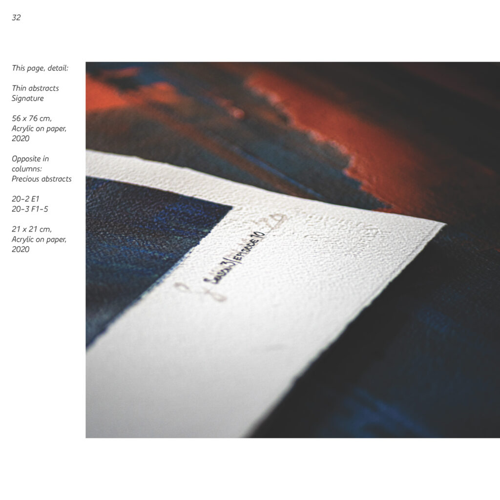
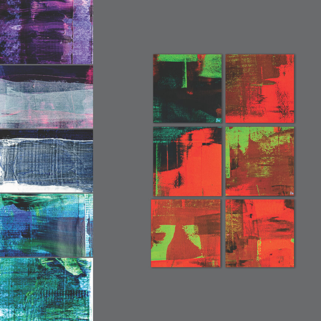
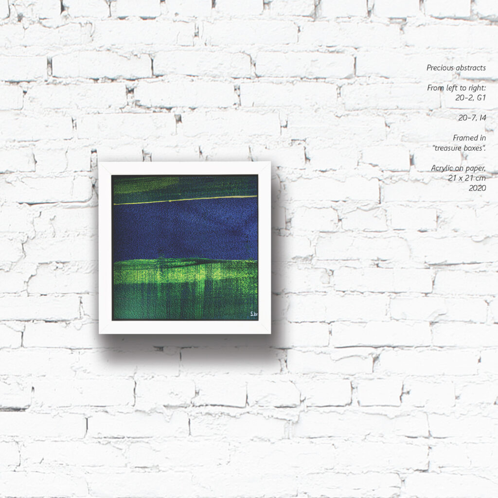
Starting from experiments with colour combinations on small snippets of paper, this series evolved into a pure celebration of colour and technique. I’ve been collecting small (mostly DIN A5 or 21 x 21 cm, cf. pp. 26, 35 etc.) sketches with various colour combinations as preparation for portrait work and conceptual designs for years, gathered together in series Precious atmospheres. It only is natural that these snippets continue to grow in size. The Thin abstracts series is in a way a culmination.
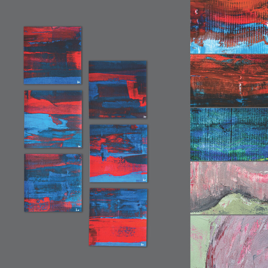
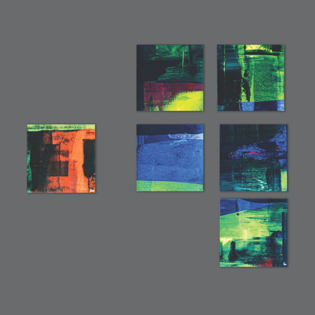
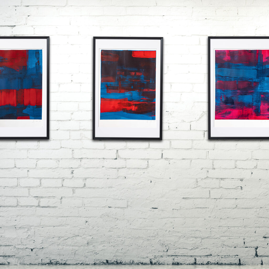
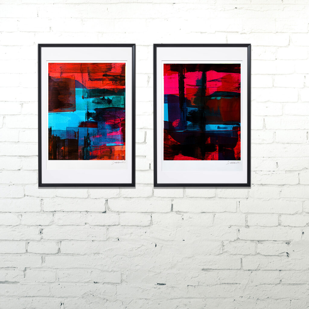
The Precious abstracts series is a warm-up to the larger scale Thin series. The nomenclature follows the source colour combination (e.g. warm/ cold), the season, and an episode number numbering, inspired by the endless variety and monotony of streaming content.
However, monotony can be something to strive for.
Concepts in a post-factual world
The pieces are wilfully decorative. It felt only appropriate that in 2020 art should be enjoyed as a form of distraction, and “the concept” need take a step back. Everywhere we look, art seems to want to challenge, explain, confront, or provoke. But if everything is provocative, isn’t it all boring? Being surprising has become a science (for example, in the form of social media marketing), but obstinate blandness is currently truly outstanding. Boringly decorative is so rare these days.
| Season 1 | 20-4 | Episodes 1-12 |
| Season 2 | 20-5 | Episodes 1-12 |
| Season 3 | 20-6 | Episodes 1-12 |
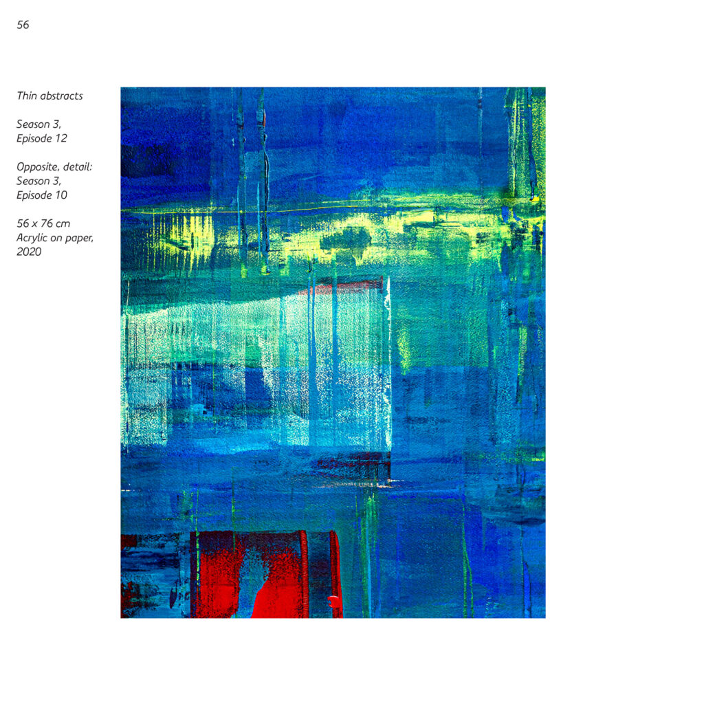
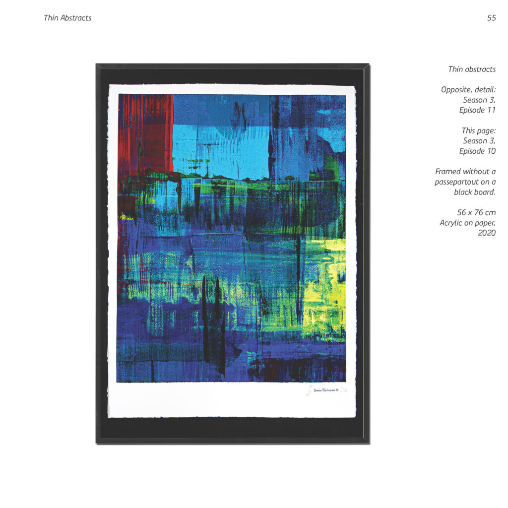
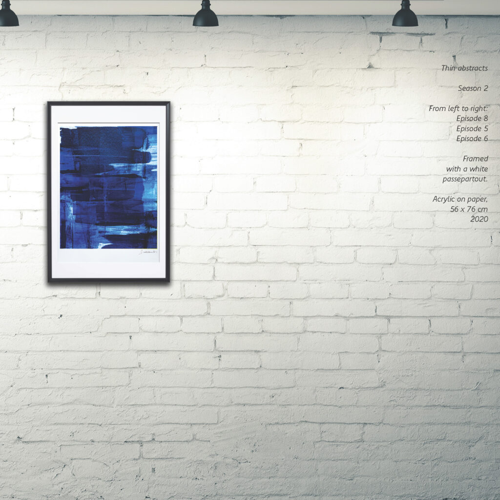
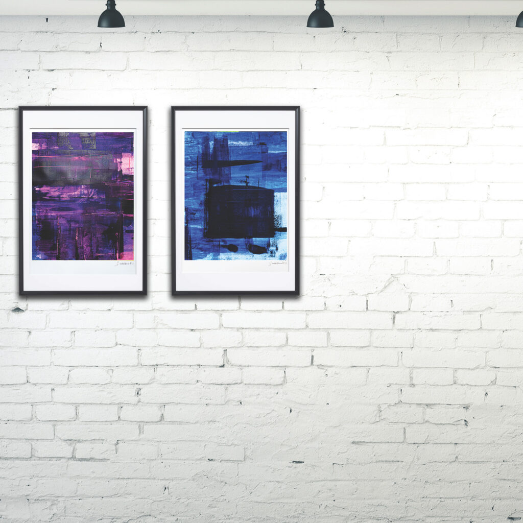
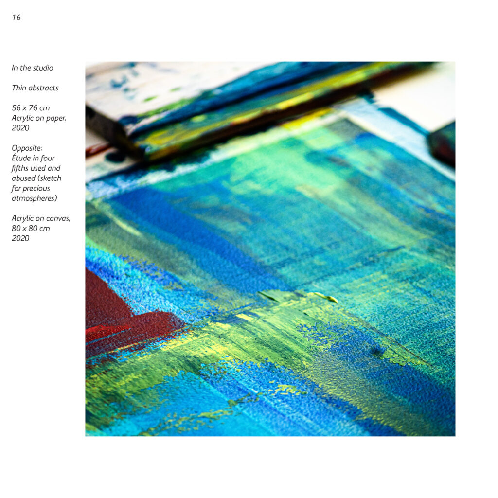
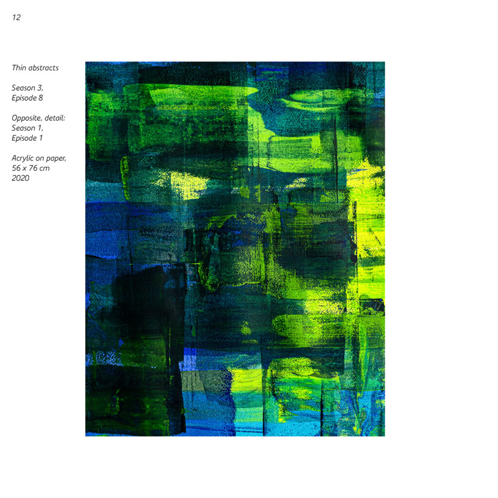
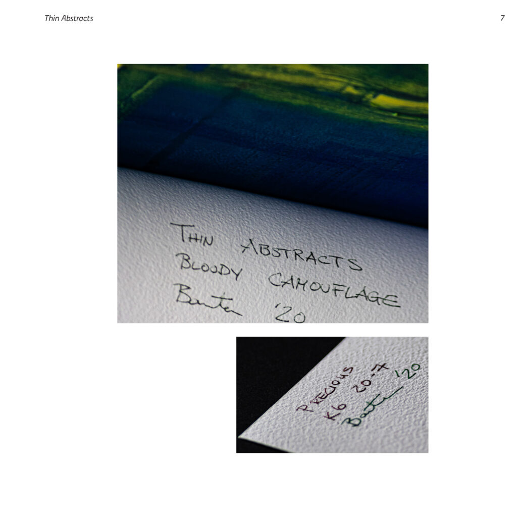
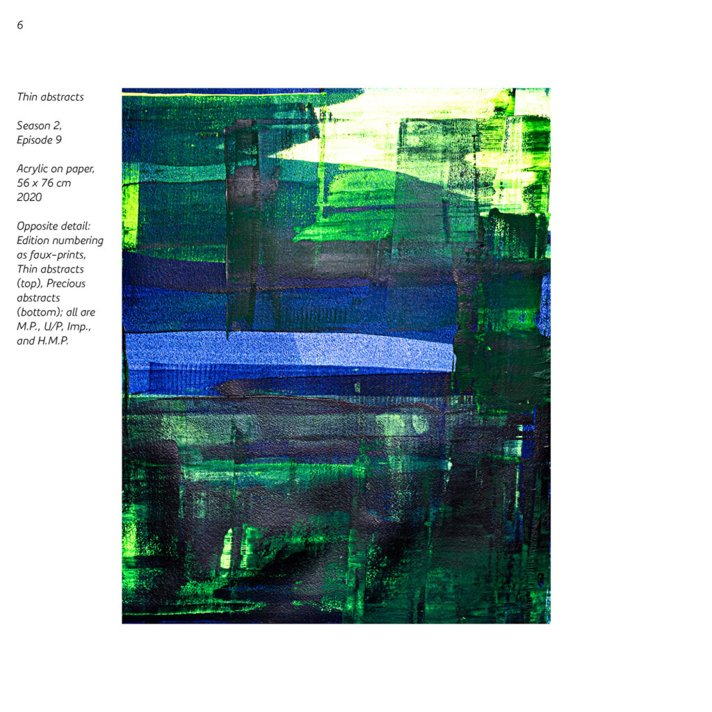
56 x 76
| Atmospheres | 20-2 | A1-2, B1, D1, E1, G1-3 |
| Atmospheres | 20-3 | C1-6, F1-8, H1-4 |
| Atmospheres | 20-7 | I1-6, J1-6, K1-6 |
21 x 21